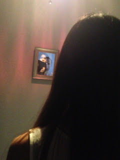
I have to various locations in order to get the photos for the magazine. I have taken over more than 50 photos, however I made a selection of the photos that I could potentially consider to include in the front cover, contents page and DPS. I will evaluate and comment on them on upcoming posts, but in this post I am including untouched, original photos. Once I have chosen the photos, I will go in more in depth analysis.
Front Covers
These are images that I have taken at the art gallery.
Contents Page
After I took the pictures, I thought that using photos as the basis of the contents page would be look much more interesting and innovative, which I think is important for an art magazine because I believe it is expected that the audience would typically expect the unconventional, and want an art magazine to be done just as creatively as the art itself that the magazine is featuring. So instead of my flat plans where the background would be plain white, I will use one of the following photos.
Double Page Spread
I'm grouping the following photos into two loose selections as the images need to have some sort of unity between in order to create a cohesive and clear double page spread. Grouping them also makes it clear to me which images would be appropriate for a certain type of article/interview, and which are not. Note: I may add more photos to them.
Group 1

This photo is black and white, but the rest is untouched.
Group 2
These are my original photos that I have taken when I was in Paris.
You can see my reflection in the image above, but if I plan to use this in the magazine I intend to use Photoshop to get rid of it.


No comments:
Post a Comment